


Branding Kalooki
Creating a brand for a Jamaican card game
2024 - Present
About the Project
This began as a project for a visual design and branding course I took in my masters. We were asked to created a brand for an existing or new product. I decided to create a brand for a Jamaican card game I grew up playing in my family. After completing the project, I decided that it was something I wanted to keep working on and developing to give my family a unique version of our favorite card game.
Brand Personality
Kalooki is a fast paced game that encourages players to think strategically. This develops a sense of playful competitiveness among players that brings more life into the game. Kalooki thrives off of the players and their energy. Because of this, our brand personality is:
Jester

Players enjoy and thrive off of competitive banter
Everyman

Everyone can play and enjoy Kalooki regardless of age or background
Sage
Winning each round requires players to think strategically
Main Logo

Logo Variations


Color Palette
Kalooki Yellow
Scotch Bonnet
Kalooki Green
Bush Tea
Sandy Beach
Pimento
Kalooki Black
Our Pattern

The dutch pot, pear, mango, boil dumpling and waves are representative of the Caribbean.
Ackee and Lignum Vitae are the national fruit and flower of Jamaica.
Each object was designed to show the general shape and form so that all elements of the pattern could be visible when scaled down. It also allows
players to spend time guessing what
each element represents.
The heart, clubs, spades, and diamonds were added to the pattern to represent the suit of cards.


Sample Applications

Box Design

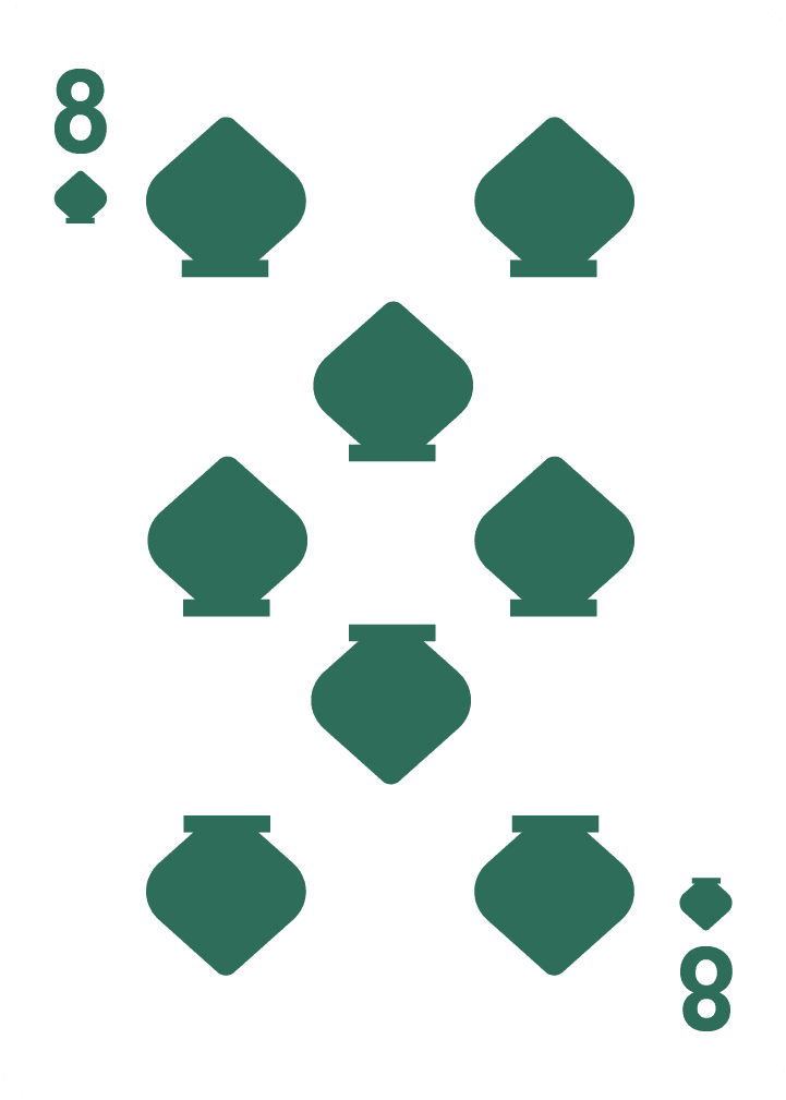
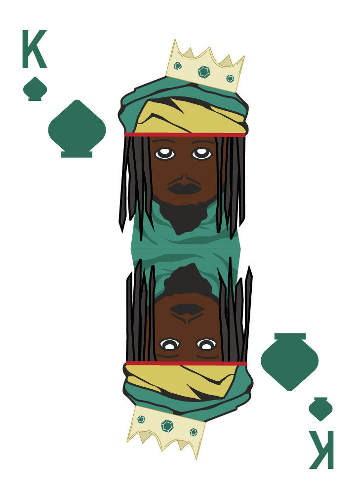
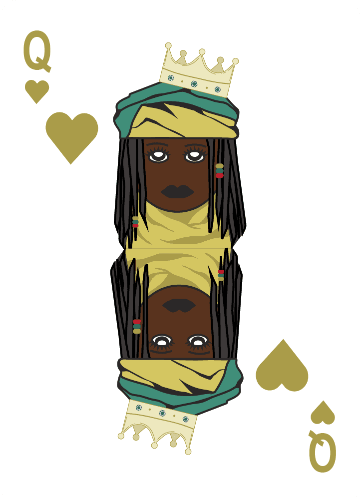
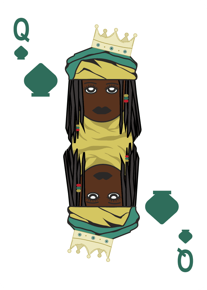
Game Cards

Scoresheet

Web Ad

Mobile App

Stickers

Emily Layton © 2025