Sam’s Club Tire and Battery Center
Creating a mobile solution to improve member-associate interactions during vehicle service.
Duration
4 months
Role
Research and Design
Team
5 members
Tools
Figma


The Problem
The Tire and Battery Center aims to increase associate productivity, promote its services, and provide members with the best experience by helping its members maintain quality tires. Due to several factors such as long wait times with no status updates, lack of online appointment creation, documentation, members found the service process to be difficult leading to friction between members and associates.
Problem Statement
How might we enhance member-associate interactions and communications within TBC to create a more efficient, informative, and enjoyable experience for members?
The Solution
Integrate Tire and Battery Services on the existing Sam's Club app where members can schedule appointments, view status updates, save vehicle information, and view past visits. This is paired with a physical key drop-off locker located in stores to help alleviate wait times.
Discover
Research Methods

Field Observations
Competitor Analysis
Contextual Inquiry
Interviews
Field Observation
Researcher, Note Taker, Analyst
Research Goal
Observe member-associates interactions on-site
Focus
Environment
Store layout
Service
Signage
Customer traffic and sentiment
Key Findings
Layout Differences: This was something to think about when considering physical solutions.
Offerings: We learned more about the products and services offered to members.
Interaction and Service: We got a better understanding of the vehicle service process and got to see member-associate interactions.


Define
Analyzing data
Affinity Mapping
Research Goal
To organize and interpret insights to visualize patterns, identify pain points, inform design implications, and inspire design ideas.
Key Findings
Members are unaware of the services and products offered by the TBC
There is tension between members and associates due to long wait times and inconsistent information.
There is miscommunication between members and associates due to the lack of record keeping.
Members struggle to find service information both in-store and online.


User Needs
Identifying overarching themes from our research led to the creation of 4 user needs that determined what we wanted our solution to address.
User Need #1
Enhance communication efficiency between members and associates and reduce repetitive paperwork.
User Need #2
Give users a way to maintain an easily accessible record of their work order history.
User Need #3
Provide members with the ability to manage appointments.
User Need #4
Ensure that members are informed about their current work order status and pickup time.
Design Implications
User needs were then turned into design implications to ensure that our designs met all user needs from a design standpoint.
Design Implication #1
Provide users with the ability to manage appointments on their own
Design Implication #2
Provide the users with a way to view status updates with estimated time of completion
Design Implication #3
Provide users with a to view, save, and update information
Design
Ideation and Wireframing
Sketched Concepts
Concept 1
Concept 2
Concept 3
Concept 4
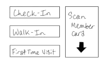
Interactive Kiosk and Key Locker
An interactive kiosk and key drop-off locker system that members use to check in, review their appointment, and drop-off their car key. I sketched a general idea of the interface for the kiosk and its functionality paired with the lockers.
User Needs: #1, #2, #3, and #4
Design Implications: #1, #2, and #3

Concept Testing
We presented each concept to 5 users to get initial feedback on strengths, weaknesses, improvements, accessibility concerns, and likeliness to be used. Based on feedback given, we found that users liked the kiosk and locker idea, but wanted to add features from the other concepts. We decided to move forward with a kiosk /locker system and a mobile app.
Wireframing
Version 1
We created system flows and wireframes for the kiosk and mobile app solutions.

Kiosk Flow

Kiosk Wireframes

Mobile App Flow

Mobile App Wireframes
Wireframe Feedback
These set of wireframes received feedback from 3 users who looked at user flow, UI design, and accessibility. The biggest feedback we received was that the kiosk and mobile solutions being separate didn't make sense. If they both handled the same information, why weren't they just one system? This was a valid point, so we decided to get rid of the kiosk and just add the features to a mobile app.
Version 2
Mobile App Flow


Deliver
Final Prototypes and Testing
Home Screen and Add Vehicle Feature
We added a feature to allow users to add their vehicle information manually or through their VIN code.


Schedule an Appointment Feature
As users wanted to be able to schedule their own appointments, we added a feature allowing them to manage appointments through the app.
Check-in and Service Status Updates
We moved the physical kiosk into the app so users can check-in from the app and drop their keys into the locker located in the TBC.


Service History
Users wanted to be able to view and keep their service history in an easier way, so we added a section on the app to allow users to view information on all of their services.
Testing
Heuristic Evaluations and Usability Testing
Design Consistency
Differentiate links and headers by making them different colors (expert evaluator)
Be careful with colors like grey that may make some text seem disabled (expert evaluator)
Add visual elements to explain information to visual learners (user)


Usability
Progress bars should have more information and be interactive to allow users to move through the process at their own pace (expert evaluator)
Improve the clarity of the instructions as it was difficult to understand what to do (user)


Wrapping Up
Lessons Learned
The conclusion of the project was a presentation to various stakeholders where they expressed their excitement of the work we had done. Our project was taken as a foundational tool for continuing to improve the Tire and Battery Center experience. A few of the lessons I learned working on this project were:
Spending more time narrowing down the problem space early on would have helped us focus our research a lot faster.
Prioritizing testing with users in store would have been very helpful, so that is something I would want to do next time.
Working in a team can be difficult from scheduling, planning, and decision making, but it was very fulfilling because I was able to learn from my teammates in both research and design.

Emily Layton © 2025